The meaning of Anara
At Anara, every detail ~ from our name to our emblem, colours and packaging ~ has been created with intention. This page shares the story behind the symbols and sensory elements that shape who we are.

It's all in the name
ANARA is the combination of two words:
INARA ~ which means radiant, illuminated or ray of light in Arabic.
&
ANAR ~ meaning pomegranate in many cultures, a fruit long associated with love, beauty and abundance.
ANARA also beautifully holds Founder Arati Nar's name within it ~ a subtle reminder of the personal love and care poured into the brand.

Our emblem
Our emblem was the first element designed for Anara. It led the visual direction for everything that followed.
It is formed from three shapes in multiples of four, each chosen for its meaning:
Hearts - symbolising the love, compassion and humanity in every step of our journey.
Diamonds - representing clarity, balance, and renewal.
Stars - a symbol of positivity, happiness, and a touch of magic.
Together they form a modern, quietly luxurious mark of grounding and light.

The power of colour
We chose Anara's soft mauve with intention.
This unique shade is created from a balance of grey (calm, neutrality, grounding) and pink (healing, softness, peace), coming together to form a tone associated with decadence, youth and purity.
It reflects everything Anara stands for ~ gentle strength, elegance, and emotional warmth.

Our packaging
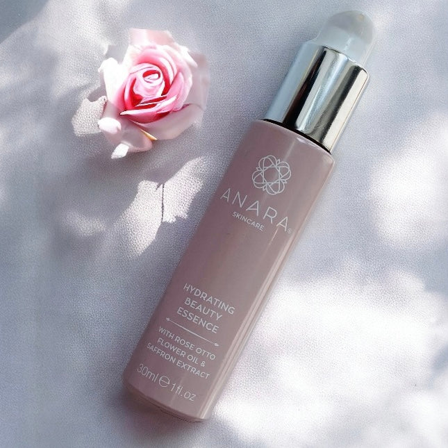
Every Anara product is presented in recyclable glass bottles and jars, decorated with high-quality organic ink and designed to last.
Our twist lock pumps protect the natural-origin ingredients, keeping them fresh and hygienic.
Our cartons are FSC certified confirming that the forests used are managed ethically, supporting biodiversity and local communities.

